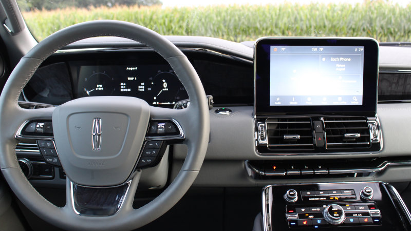
Many of the newer Lincoln products may differ greatly in design and experience from their Ford counterparts, but infotainment software is still very much shared between the two brands. That said, Lincoln has made every effort to make its version of Sync 3 more expensive and premium compared to Ford’s.
If you can see it in terms of Android smartphones, Sync 3 in Ford vehicles is comparable to Google software. Sync 3 in Lincoln products is similar to Samsung’s user interface, which means a totally new look and added features. The core interface remains the same for the two brands. Lincoln’s hip new look can be customized with a few different color combinations, but they generally all consist of muted hues that exude old-world luxury more than the heavy-handed blues on Ford’s version of Sync. A handy similarity between the two is Apple CarPlay and Android Auto, both of which require wired connections. Some may find that the functionality of the Apple / Android interfaces is compromised, as described in our Ford Escape in-drive test).
Sync 3 has a bottom bar with quick switching, frequently used apps and a Home button in the top left corner. It makes it quick and easy to get to a particular set of menus. Square icons are used in menus with a large font and intuitive scrolling functionality. There are no redundant scroll wheels or touch pads to operate the screen interface in Lincoln’s vehicles, so you should be familiar with a touchscreen. Fortunately, there are hard buttons on the dashboard for climate control and general audio functions.
In the Lincoln Navigator we use to demonstrate the technology, Sync 3 is smooth and generally free of stutter. However, it’s not foolproof and tablet-slick like slogging through the latest BMW or Mercedes infotainment systems. Lincoln uses Sync 3 on all of its current models, and in the Navigator it plays on a large 10-inch screen.
The extra luxury features for Lincolns usually dictate whatever extras you see in the software. There are settings for a wide range of ambient lighting, hugely complex seat controls (for the 30-way massage seats) and a number of adjustment options for the excellent Revel audio system (optional). Lincoln sets itself apart even further with the fully digital instrument cluster that flanks the large screen. The Lincoln’s has taken simplicity to another level, which is perfect for a panel with the sole purpose of informing the driver of essential vehicle information. Our biggest complaint about the cluster is the speed at which it moves through screens and animations. There is a decent delay between pressing a button or the movement of the mode button before anything happens on the screen. Speed up this process and it will feel like a much-polished product.
Simplicity and ease of use are the two overarching themes that come to mind when we take a step back from using Sync 3. Of course you can experience ‘ENERGIZING COMFORT’ in a Mercedes-Benz and ‘Caring Car’ in a BMW (both unnecessary but undeniably interesting comfort programs), but the interfaces of those infotainment systems are designed with the tech-savvy buyer in mind. Assuming you take the time to learn the intricacies and complex menus, the benefits far outweigh what Lincoln has to offer. However, there is a lot to be said for simple, beautiful software that does the basic job well. Lincoln’s Sync 3 does just that.
Related video:
