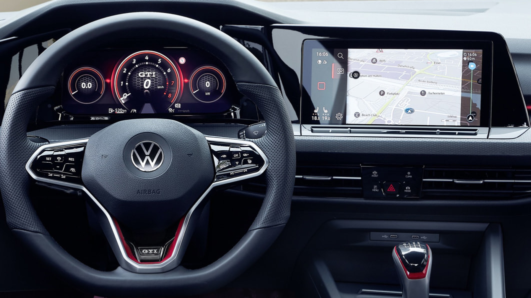
I had very few complaints about the 2021 Volkswagen Golf R last week on my first drive, but the execution of its beautiful new technology was the biggest. There are certainly issues, but it’s nuanced enough to warrant this separate review, where I’ll go into more detail about what this new infotainment and tech interface is good at and where it falls short.
VW calls this new interior the ‘digital interior’ and that is not without reason. The whole thing has been digitized in a way that Volkswagens of the past never were. It begs the question of where the infotainment system begins and ends, as the days of a screen being separated and disconnected from the various buttons and buttons on the dash are over. And in the case of VW, the survivability of buttons and buttons in general is low. New, budget-oriented cars like the 2022 Taos still have VW’s old interior philosophy, but that’s not the case for its flagship products like the GTI, Golf R and ID.4. This review only applies to those last three, because the next-generation systems found in those cars are so different from others (in the Tiguan, Passat or Atlas) that VW’s digital roots are barely recognizable. VW’s other models will eventually get similar systems, but Volkswagen will have to transition those models to the new electronic architecture that makes it possible in the ID.4 and the new generation Golf.
The high-resolution 10-inch touchscreen integrated into a hood that curves around the driver (in the GTI and Golf R) is the crown jewel of this infotainment system. It’s a responsive touchscreen that’s easy to reach and angled towards the driver so the passenger can still use it easily. Responsiveness and speed are of paramount importance. You can swipe and tap the screen as if you were using a high-quality tablet, and it showed no lag. There are no touchpads or scroll wheels to control it, so it’s a full touch experience.
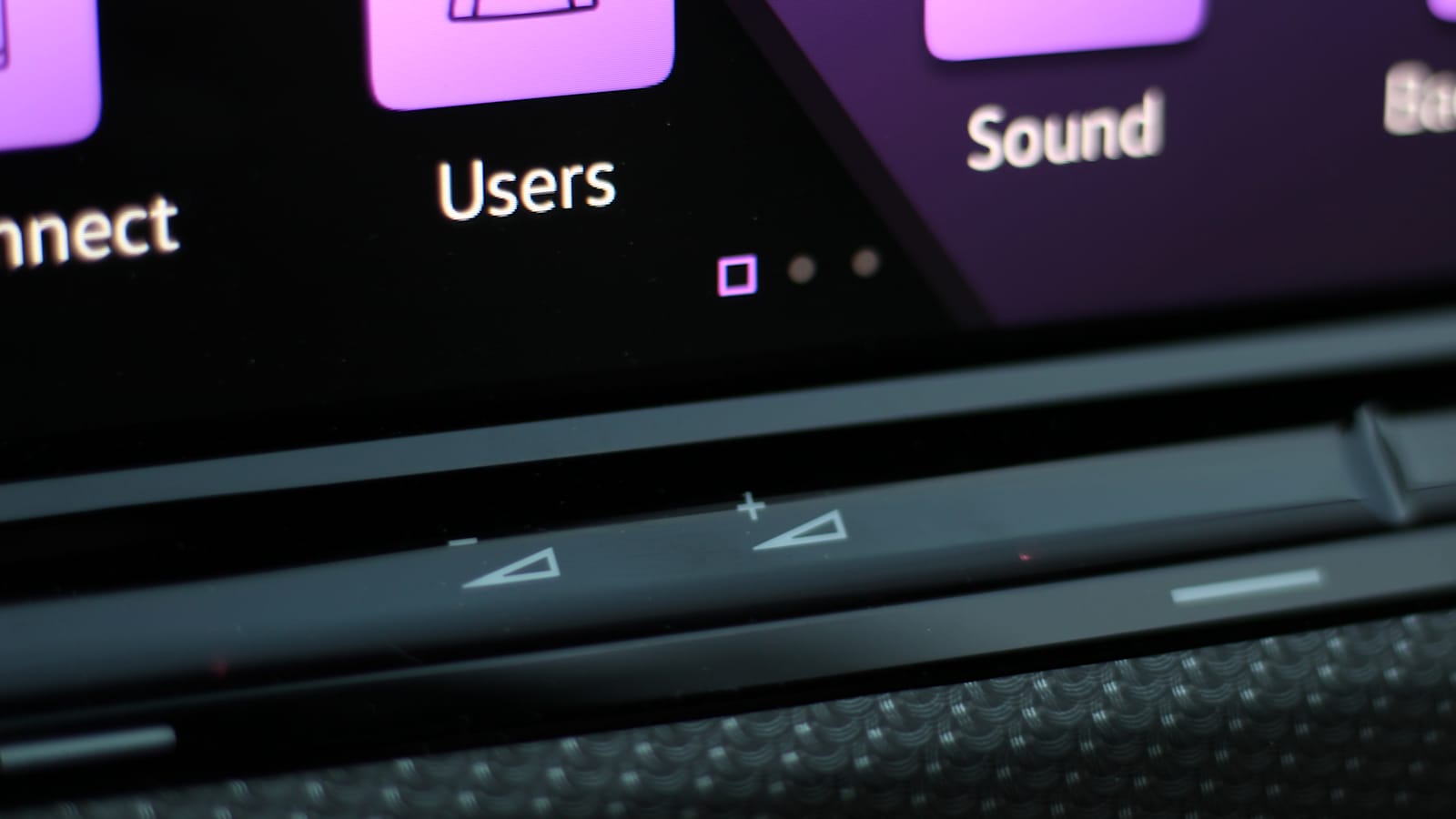
That touch experience extends to the rest of the interior as well, as VW decided that touch controls are today. Unfortunately, these controls are where things fall apart. There is no simple volume knob. Instead, VW gives you a volume slider integrated into a piece of piano black plastic that protrudes just below the 10-inch screen. Here you can tap the +/- buttons or slide your finger back and forth to change the volume. This interface was a terrible idea when Lincoln and Cadillac tried to do the same a few years ago and it’s just as annoying in a VW today. Tapping over and over to somehow turn the volume is tedious work, and the slider works sometimes, but other times it struggles to read swipes. And then there’s the placement of the touch controls. They are exactly where I would like to rest/support my hand to use the infotainment system. But do that and you accidentally turn up the volume. Or! You accidentally adjust the climate controls flanking the volume slider and its touch controls too.
The solution? You either have to find the perfect spot to rest your palm between the volume and climate controls, or just the freehand touch controls. Anyone who has tried to operate a touchscreen while driving down a bumpy road (especially in a car with sport-tuned suspension) knows that sticking out as your arm moves up and down often leads to wrong selections. It’s fine if you’re standing still or on slippery roads, but this design will inevitably lead to frustration as an owner.
Good news: the interface of the infotainment system ‘Discover Pro’ is easy to use. It’s like an old iPhone, when they had “home” buttons. At the far left of the screen is a ‘home’ button that takes you back to the main set of apps anytime, anywhere. You can scroll up and down through app icons or swipe forward to find what we call widgets. There are tiles for navigation, ride data, current media and so on that can be moved and adjusted. And if customization is your thing, VW lets you change the colors of the infotainment system, digital instrument panel and mood lighting. From this perspective, it’s about as customizable as cars can get in 2021.
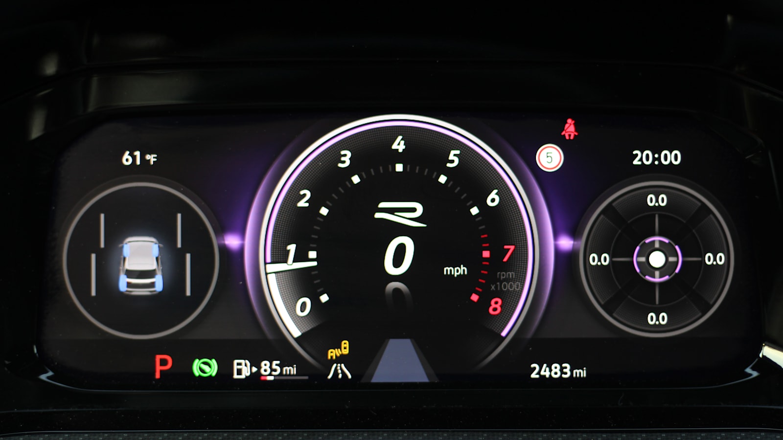
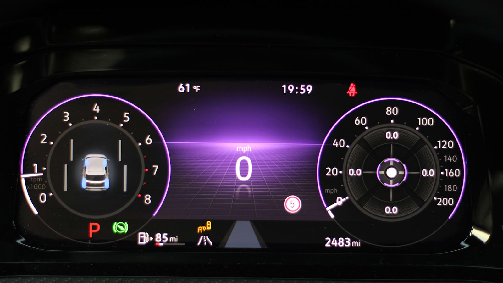
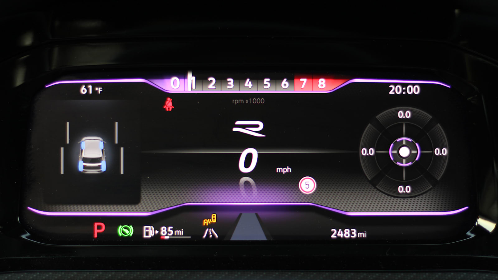
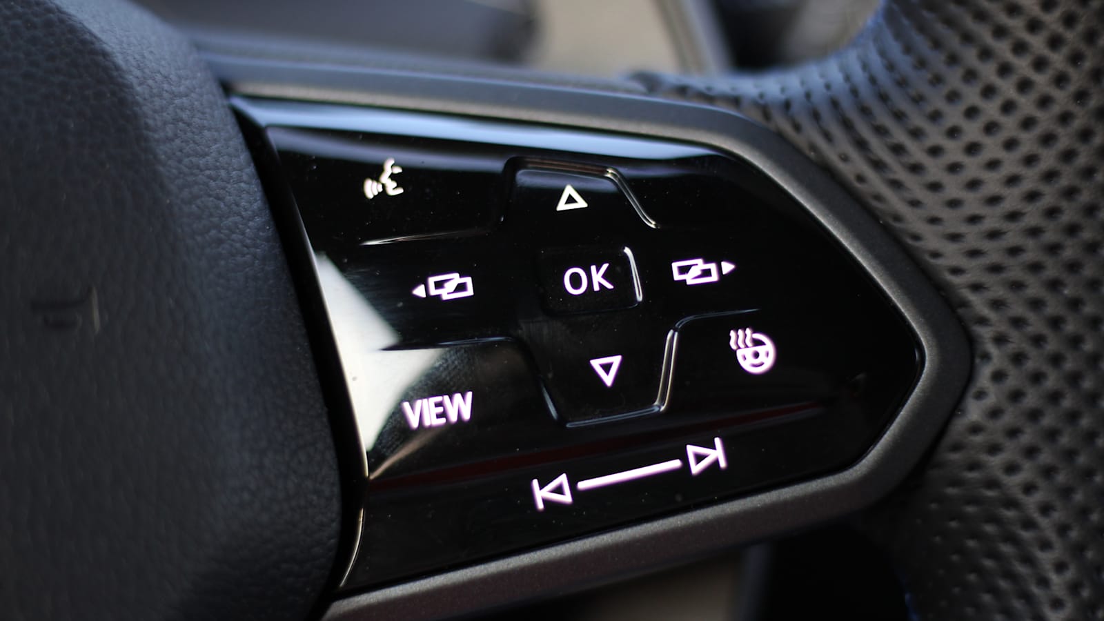
That digital cluster is now called Digital Cockpit Pro and it’s a 10.25-inch driver screen. Multiple display modes are available, and models such as the GTI and Golf R receive dedicated performance displays that show key information in an easily digestible format. There’s even a new steering wheel to control that cluster. It features the same haptic touch keys as the steering wheel of the new Arteon. Turning up the volume or going to the next track is much easier on the steering wheel itself, because in addition to the touch controls, you can just press it like a traditional button, and it works perfectly. VW’s sleek digital steering wheel is the best we’ve tried yet, and it works even better than Mercedes’ new haptic touch wheel on the E-Class.
The only other buttons you’ll use in the cabin are shortcuts for the infotainment system built into the dash through the vents. Squeezed into their small area, here you can open menus for frequently used settings such as the driver aids or climate controls. Volkswagen went to such lengths to keep the dashboard free of actual buttons that it even placed the front and rear defrost buttons in the headlights on the left side of the steering wheel – remember that for the first frosty day with your new GTI.
This cacophony of technology is a step forward for VW when viewed from the air. There are certainly some details that require some work, but Volkswagen is really in the digital age right now. You get the expected features of wireless Apple CarPlay and wireless Android Auto in addition to the UI that feels like 2021. I know I’ll be nostalgic for VW’s earlier lineup of oh-so-German knobs and buttons, but there’s no doubt these flashy , new philosophy for infotainment VW interiors enthusiastically catapults into our technology-centric world.
Related video:
