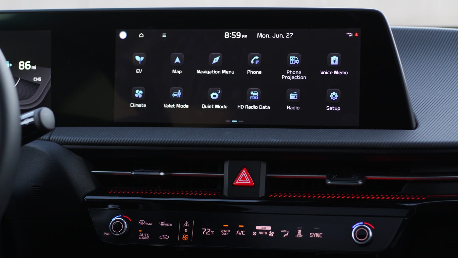
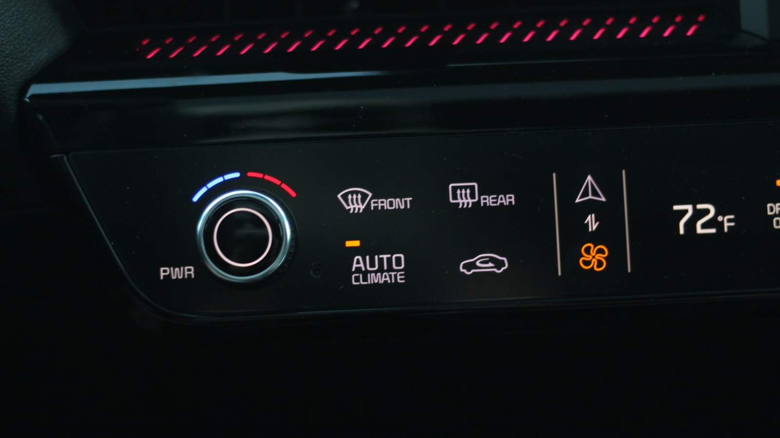
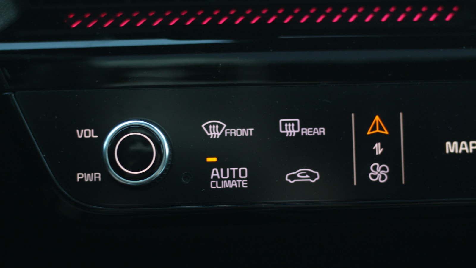
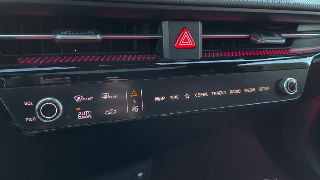
The 2022 Kia EV6’s climate and radio control panel is weird. It mainly consists of touch controls, but there are also two buttons. Contrary to common logic, those two buttons don’t always control the same thing at the same time. Yeah, that’s where things get weird.
This is a situation where Kia has tried to have his pie and eat it too. Rather than having one set of controls for climate settings and another for radio/navigation, Kia has decided it’s best to have a single strip of controls that you can change on the fly. Some sort of mode switch is indicated by a fan and navigation arrow. Tap the touchscreen here and you’ll switch the operating mode between displaying climate control settings and radio/navigation control settings. Yes, this means that the touch panel of the controls will only show one or the other at any time. It’s not just the touchscreen that changes, but the buttons do different things based on the mode you’ve activated. If you are in climate mode, change the temperature setting by turning the knob. However, when you are in radio/navigation mode, the button on the driver’s side turns into a volume rocker and the button on the passenger side into a tuning wheel.
It’s complicated to explain in words, but here’s a video to show it in action.
@autoblog 2022 Kia EV6 touch bar climate and radio control #carsoftiktok #kia #ev #electriccar ♬ original sound AllNews
The idea here is pretty clear. Kia didn’t want to bury all of the vital car controls in the main touchscreen, but it also didn’t want to fill the dashboard with more buttons than needed. There’s also the technical aspect, in the sense that such a control interface looks and feels futuristic compared to the company’s other center consoles.
Over the past few weeks, I’ve developed a love/irritation relationship with how these controls work in everyday life with our new long-term tester. On the plus side, if you’re looking for a button, it exists and you don’t have to wade through the infotainment system to find it. You may have to tap the mode switch to find it, but at least it’s there. I’m especially a big fan of the “Favorites” button, which is indicated by a star that can be assigned to whatever shortcut you want – I set mine up to go straight to Apple CarPlay/Android Auto. More and more new cars are dropping physical controls to dump everything into the main touchscreen, requiring multiple touches to find the effect you want, but not here.


On the other hand, I often forget which mode I have set the touchbar to. I turn the volume up or down with the handy knob, but then quickly realize I’ve just set the climate control to a red-hot temperature instead of turning up the volume. This results in me having to turn the climate control back to normal, tap the mode switch (which is small enough to miss with a finger every now and then), then turn the volume up. All that distracts a fraction of my attention from the road. And sure, maybe it’s my fault I didn’t remember or see out of the corner of my eye which controls were displayed. But maybe it was also my passenger who put it in climate control mode because they were cold, and then never switched it back. It’s something that has come up again and again, even after I got used to the system completely.
The only accidental input you’ll ever make will also be with the buttons. All other controls are operated like a touchscreen, so you have to see and focus on what you’re sticking your finger on, with the operator having to at least look and read what he’s pressing.
I feel like this is a good and a bad solution at the same time. Better than putting every last control on the main touchscreen. But it is also problematic because many owners sometimes get annoyed by incorrect input. My recommendation would be to try and keep it on the radio/navigation buttons as much as possible. That way, when a good song comes up and your natural instinct to dial the nearest knob kicks in, you’re doing exactly what you intended.
Related video:
