LOS ANGELES — When the new Range Rover was first unveiled Monday in North America under the epic spherical Oscars museum theater, Land Rover design director Gerry McGovern spoke repeatedly of the philosophy of “modern, reductive design” that drives the latest generation of a car icon. By ‘reducing’ he meant free from excessive lines and embellishments, the former of which is commonly seen in the automotive industry, while the latter is something the last two Range Rovers were not immune to, especially after mid-cycle refreshes. McGovern quoted famed architect Ludwig Mies van der Rohe’s well-known mantra “less is more” and expressed admiration for Coco Chanel, who said, “Some people think that luxury is the opposite of poverty. It isn’t. It’s the opposite. of vulgarity.”
But just like an architect or fashion designer, opting for a clean and reductive aesthetic requires the utmost attention to detail. You can’t rely on shiny or body slashes and folds to hide imperfect cuts or inaccurate construction. “God is in the detail”, as Van der Rohe sometimes said.
What does that mean on the Range Rover? Let’s look at a few examples.
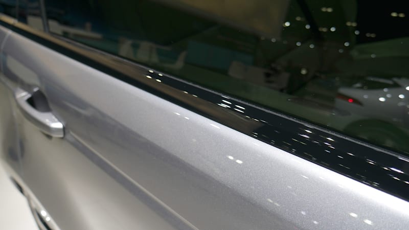
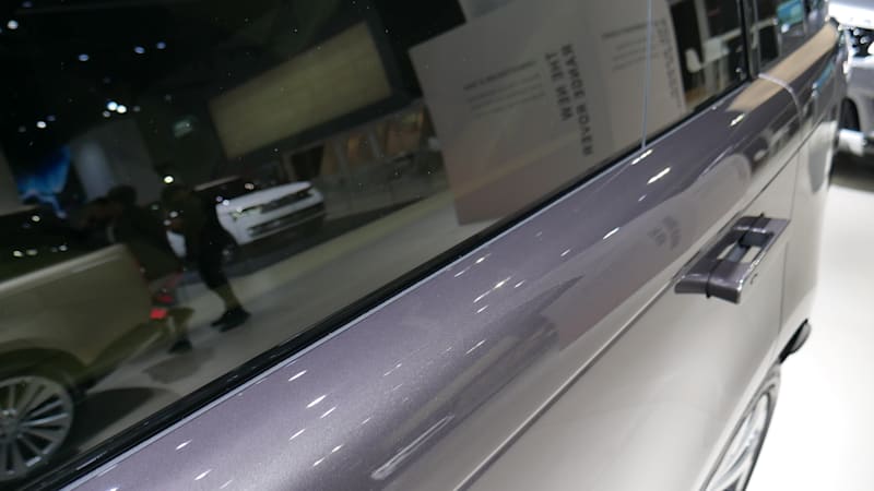
Most cars have a piece of trim that runs on top of the doors and abuts the windows for finishing and water clearing. At the top left is the Range Rover Sport, but the previous Range Rover also had such a trim. To the top right is the new Range Rover, eliminating this trim for a perfectly clean, streamlined look that isn’t easy to produce.

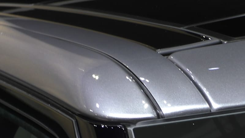
Another example is the aluminum roof of the new Range Rover, which has been lasered to the aluminum body side within a tolerance of half a millimeter. While laser-welded joints are common, aluminum is not, according to Nick Collins, Land Rover’s executive director of vehicle programs. The result is only one line visible on the roof, especially from the front of the car. Compare this to the Range Rover Sport, which has a finisher panel and thus two lines.
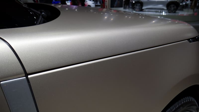
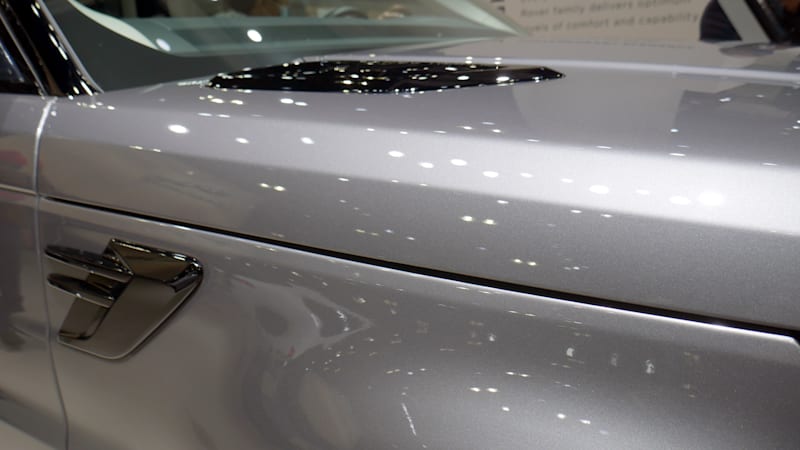
Then there are the cutting lines. Note the size difference between the “hoods” of the new Range Rover and the Range Rover Sport (top right). Is it a huge difference? Of course not, but we are talking about degree of precision here, and that matters. Notably, it allows for a much thinner full-length body line that stays in line with the bonnet cut. Check out the difference below.


Also note how clean and flat the body sides are on the new Range Rover (top left) compared to the previous generation model (top right). This speaks to both the decision for a reductive, modern design and the construction methods needed to make it happen.
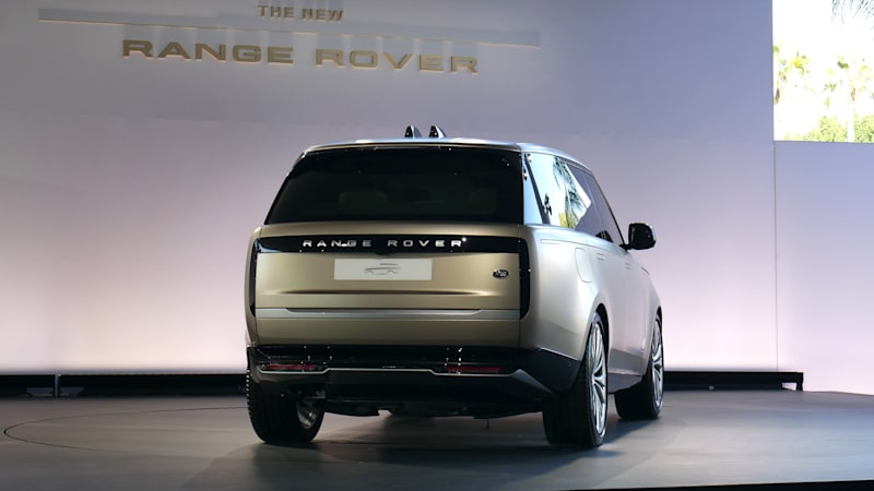
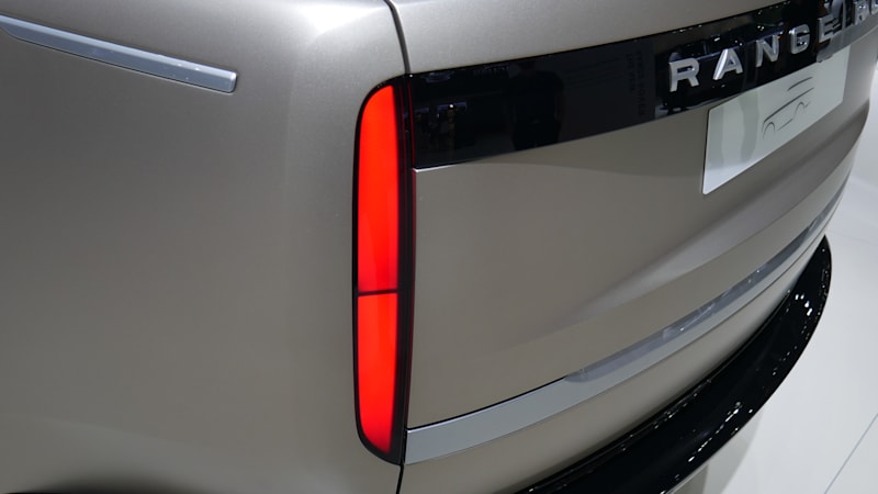
Another detail that seems more difficult than it looks is the new “hidden-to-illuminate” taillights. When unlit, the taillight panels are indistinguishable from the piano black trim that runs over the tailgate. However, to meet legal requirements for brightness, Collins said Land Rover must use the most powerful LED taillights ever made. It was the only way to get the surface perfectly black and still brighten it up enough.

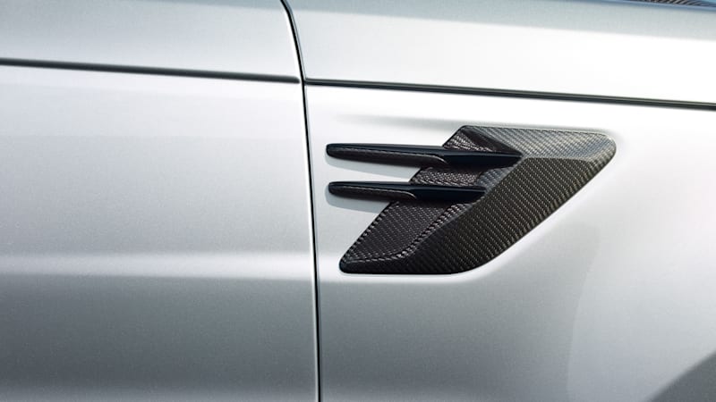
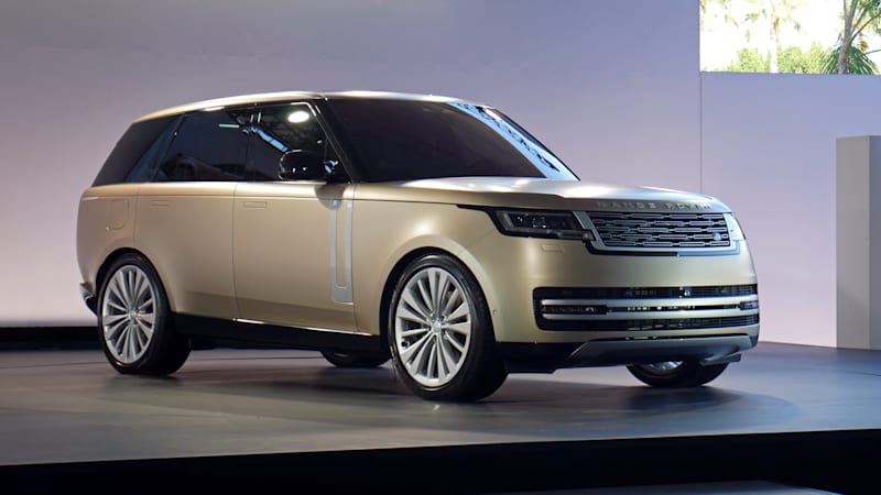
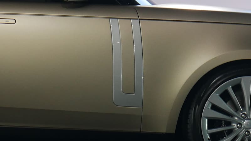
Finally, when we talk about reductive design and the idea of ’less is more’, take a look at the Range Rover Sport versus the new Range Rover. Note the Sport’s black-lined vents on the hood and front fenders. There is no such frivolity on the new Range Rover, and while it has retained a trim on the doors, it no longer resembles ventilation (which was always a curious design choice for the previous generation model).
There are no doubt many other examples, especially indoors, but this should suffice to show what it takes to ensure that less is indeed more.
Related video:
