For years, actually since touchscreens appeared in cars, automotive journalists have been complaining about it. Whether it was the design, or the inconvenience, possibly even safety issues, they have been a painful spot for reviewers. I agree with most of those points, but they are also missing something. Physical switchgear can also enhance the driving experience and add character in ways a touchscreen never could.
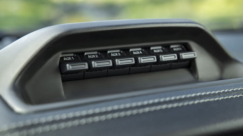
This is something I’ve been thinking about for a long time, but in recent months the focus has become much sharper, right when a Ford Ranger Tremor arrived at my house for testing. It has a series of toggle switches on the dashboard that can be connected to lights, a winch, or all kinds of other accessories. And they were so much fun to play with. They have some weight that makes them feel sturdy, but enough bounce to really pivot to any position. And the solid ka-chunk sound is brilliant. I would just flip them back and forth for no reason whatsoever, or imagine preparing the Millennium Falcon to jump into hyperspace.
It’s a shame they weren’t just part of the standard control scheme. It would be nice to have such nice switches for frequently used items such as fan settings, radio presets and the like. They would contribute to the car’s sense of robustness and make ordinary operations feel important. Some luxury brands have certainly recognized this. Lamborghini has put a safety cover on the start buttons of its cars for years, just as you would have buttons for firing weapons. Bentley has beautiful knurled organ stop flaps for pushing and pulling for opening and closing vents. Mil-Spec has small, machined aluminum toggle switches in its Hummers.
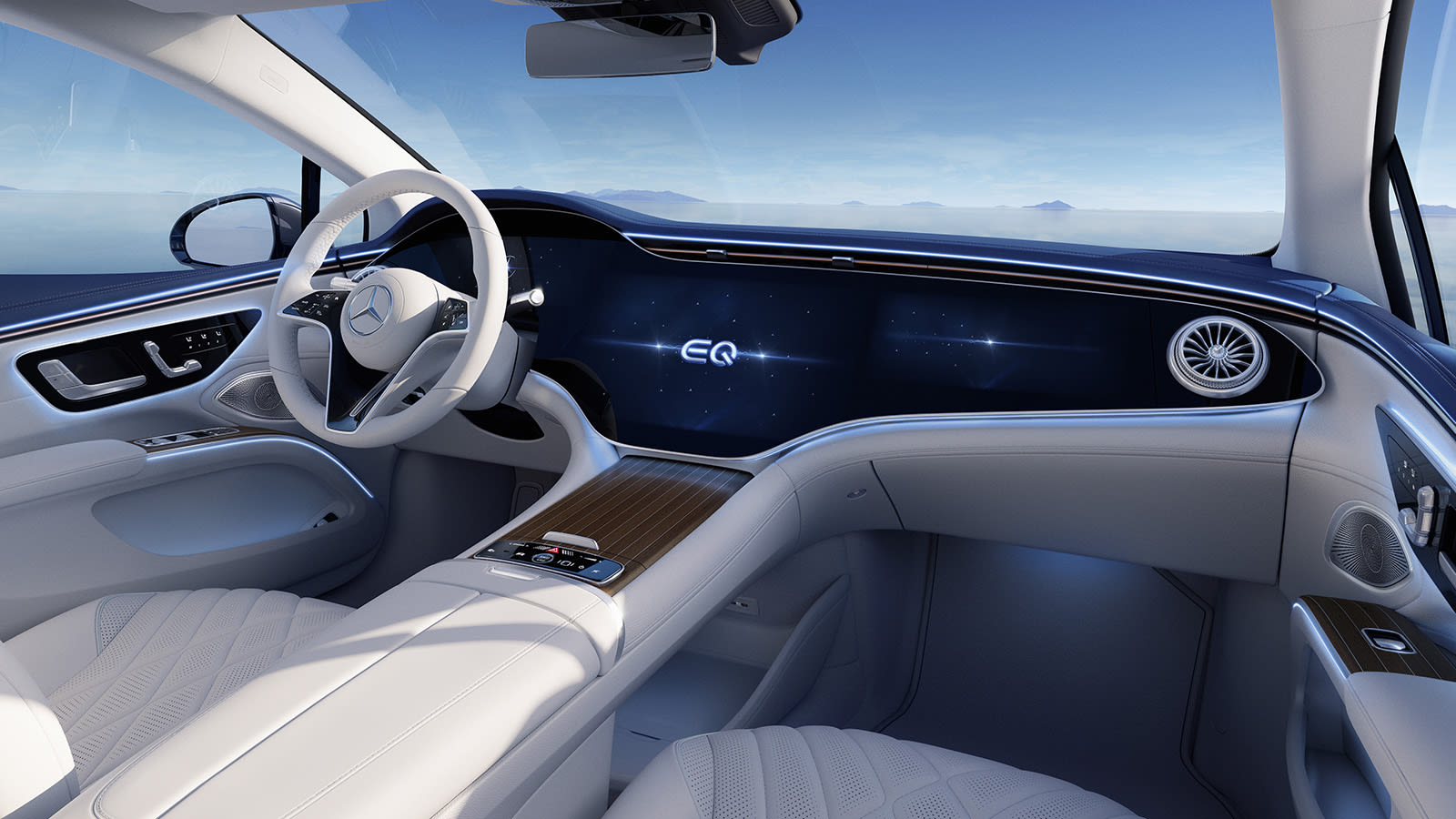
Sadly, it seems like the wider automotive world is racing to drop their physical buttons and switches as soon as possible, even the premium buttons. Few cars claim “switchgear is dead” like the Mercedes-Benz EQS and the available Hyperscreen. It’s just one giant dashboard made up of all screens and touchscreens. Everything is controlled with taps and swipes that feel like any other gesture you’ve made on your smartphone. Sure, it’s a big bright screen (one that is admittedly well integrated into the car), but it only tickles one of the senses; the feel, the sound, are not satisfying.

And aside from the sensory satisfaction of good physical controls, switches are also just easier to use while driving. Muscle memory is definitely a thing, and it makes it easier to reach a special space and grasp or squeeze a clearly shaped regulator. You feel a volume or temperature knob and know what it is, and then you instinctively know how to move it to make it do what you want. All of this means you can keep your eyes on the road more. On a touchscreen, that’s all the same tap, just in a slightly different area, and you may spend more time looking at the screen to find those buttons. In addition, you can make a good purchase on a physical control, which is useful with a bumping and bouncing car. It’s often been that it took me longer than it took to get my finger in line to hit an icon without hitting anything else.
I am not advocating the complete removal of touchscreens. They definitely have a place for less frequently used items and items that would otherwise require an absurd amount of dedicated space. Take navigation, for example. It would be awful to have an entire keyboard on the dashboard that would only be used to enter an address.
But what I do want to see is that automakers are getting the most out of the switches and buttons they have, and aren’t afraid to use them. They are often easier to use and can add some welcome fun and character to a car. And in a world where cars are getting better and better, a unique and engaging experience is more important than ever to stand out.
Related video:
