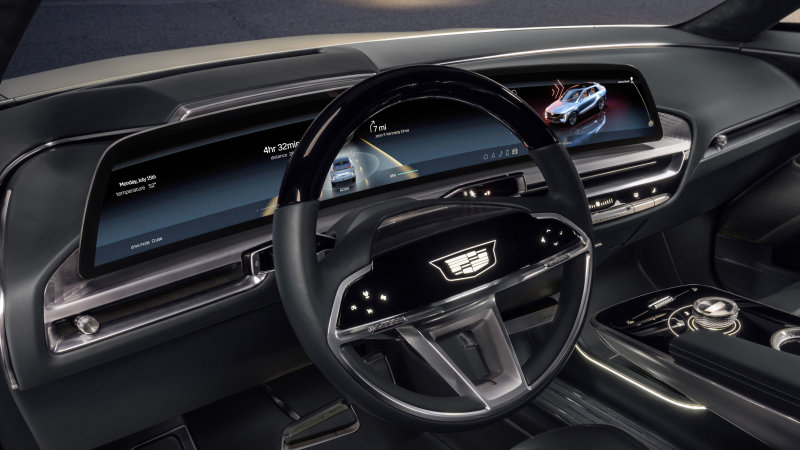
It’s screen day! Mercedes was the first with the EQS screen. Now Cadillac has just dropped more information on the massive infotainment display of its upcoming Lyriq EV, and the details are intriguing.
GM asked for some nontraditional help in designing and developing Lyriq’s infotainment system. Both Territory Studio and Rightpoint were brought in to help Cadillac put together something that hopefully doesn’t resemble the disaster that was CUE. The 33-inch LED screen that spanned the width of the dashboard gave them plenty of room to get creative. Territory Studios is a British creative agency known for its expertise in user interface design, and it has also worked on a number of video games. Rightpoint is a digital consultancy that does a lot in the digital world.
Cadillac says the two companies were “focused on artfully integrating aesthetics, purpose and technology.” We won’t know how successful they were until we give it a try, but Cadillac insists it is trying to reimagine what the user interface of an infotainment system should be. Adaptability and flexibility are two elements that Cadillac emphasizes. There will be so-called display themes “to suit the driver’s mood and personality.”
The short 25 second video clip above shows a scaled down and simple interface with a bottom row of essential function buttons. A menu list appears above, and while there are probably many color themes available, the one shown is usually dark with blue and black dominating the screen. One icon we will point out is the colorful Google Maps icon in the menu list. Will Cadillac actually use Google Maps as the factory navigation system in the Lyriq? Perhaps. It tends to be exponentially better than any navigation system designed by the manufacturer.
Cadillac says more in-depth information will be available on January 12, so come back for a deeper dive. Below you can see pictures of the car receiving this infotainment system.
