
Declaring one infotainment system best over another is an inherently subjective matter. You can check out quantitative tests for things like input response time and different screen loading times, but ask a roomful of people who’ve tried them all what their favorite is, and you’ll likely get a lot of different answers.
Some prefer systems based solely on touch with a simplistic user interface. Others may prefer a non-touch system navigable via a scroll wheel. You can compare it to the wars of the telephone operating system. Just as some people prefer Android phones over iPhones, we all have our own opinion about what the best infotainment interface is.
That said, our combined experience tells us that some infotainment systems are at least better than the rest. We’ve narrowed it down to five total systems in their own subcategories that stand out to us. Read on below to see our picks, and feel free to provide your own arguments in the comments.
Best Overall: UConnect — Various Stellantis Products
If there’s one infotainment system that we can all agree is excellent, it’s UConnect. Both UConnect 4 and the latest UConnect 5 software are also part of this praise. It has plenty of features that make it great, but most importantly, UConnect is simple and straightforward to use.
Ease of use is one of the most (if not the most) vital parts of an infotainment system interface. If you’re expected to tap a touchscreen while driving and still pay attention to the road ahead, a complex infotainment system will distract you from the most important task: driving. UConnect uses a simple interface that puts all your most important functions in a clearly displayed row at the bottom of the screen. Tap on one of them and it will immediately open that menu. We love the radio/media interface — it’s super easy to switch channels or sources. The menu structure is easy to understand and of course both Apple CarPlay and Android Auto are available if you want them.
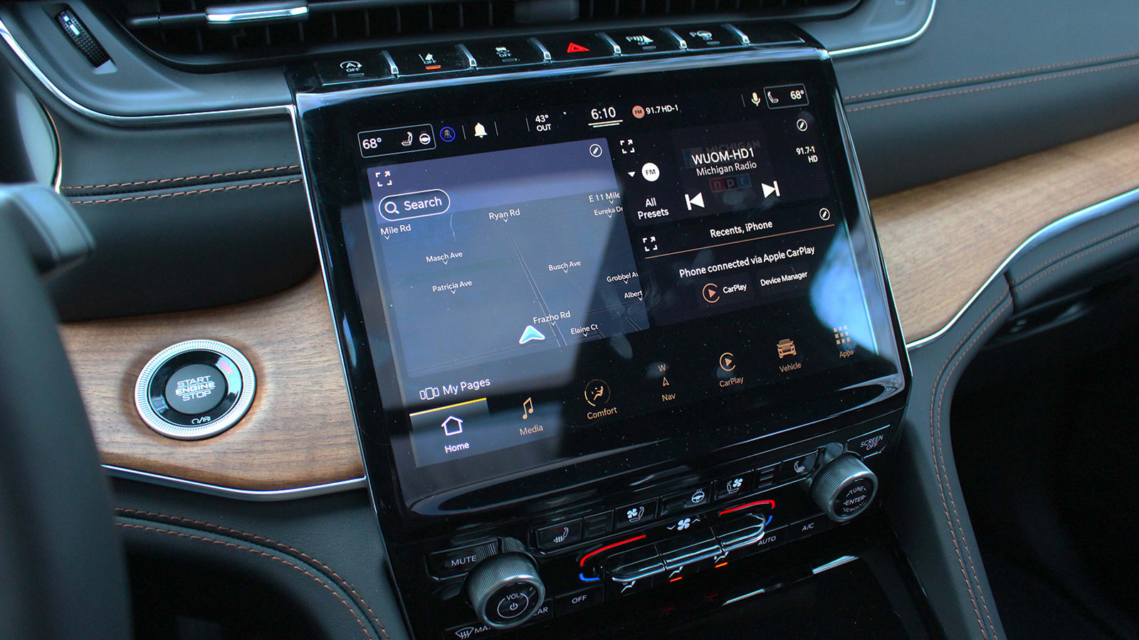
UConnect 5 is a big visual improvement over UConnect 4, but thankfully it retains the same ease of use as the outgoing system. We’ll also point out that Stellantis is able to adapt UConnect to various screen shapes and sizes with great success – it works amazingly well in the Ram’s vertical 12-inch screen. The software makes the most of the extra screen space and comes with its own screen splitting capabilities that are not possible on the more traditionally shaped screens.
Regardless of the application, whether in a Maserati or a Jeep, UConnect is flexible, easy to operate and aesthetically pleasing. It’s high-tech but doesn’t blow your mind with unnecessary features and complications, and it’s our favorite infotainment system of all.
Best Luxury: iDrive 7 — BMW
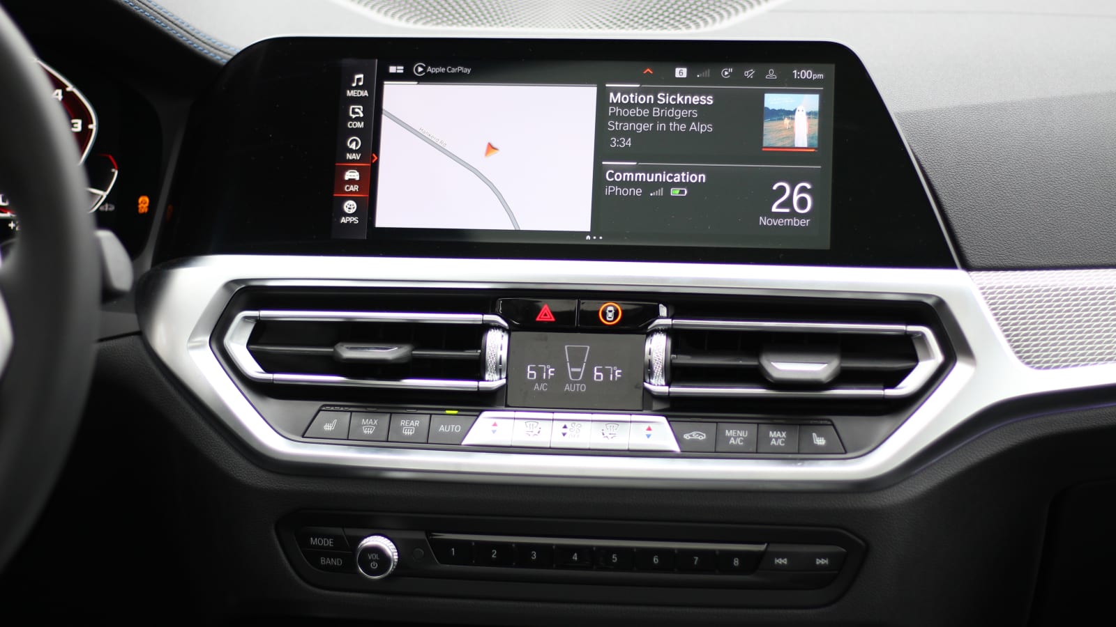
We have to specify “iDrive 7” for this, because unfortunately the just released iDrive 8 is a step back. Put the new infotainment system aside for a while, though, and focus on the goodness that is iDrive 7. BMW has been consistent in using the iDrive button for years, and iDrive 7 is as good as it gets – and maybe it’s as good as it ever will be.
Infotainment systems from luxury brands, especially European ones, are usually more complex than systems from non-luxury brands. That is no different with BMW iDrive. There are numerous settings, menus and displays to navigate through. However, BMW makes it all manageable with a logical menu structure that you can browse through quickly and efficiently with the handy iDrive button. This button is the key to this also our favorite infotainment system from a luxury brand. It allows you to fully recline with your arms in a natural position and requires much less exercise than using a touchscreen. This is a big plus to use the system safely while driving. Alternatives like touchpads or the old (and dreaded) Lexus mouse require far too much precision and concentration to work. The iDrive button scrolls, rocks and clicks, making it a natural way to move around the large, bright screens in BMWs these days.
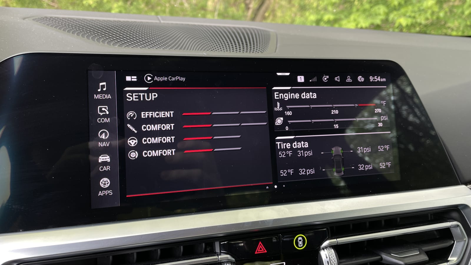
But! If you’re someone who needs a touchscreen, any car with iDrive 7 can give you just that. In addition, the touchscreen itself is extremely good and responds immediately to our touches and swipes. We wish we could say the same about iDrive 8, but our experience with this system so far has been frustrating. The previously easy-to-use menu structure is a scattered jumble of tiny icons; the system is slower/slower overall, and BMW has removed physical climate/radio controls and integrated all of them into the touchscreen instead. It requires multiple touches to perform tasks that were previously easily done with just one touch.
Despite all the praise we give iDrive 7 here, there are a few detractors that point to its subpar radio tuning capability. If you’re someone who constantly surfs random radio stations, BMW’s tuning knobs aren’t easy or quick to access. However, anyone who sets their own radio presets or simply listens to music through their phone will have no problem at all. And speaking of the phone, BMW now offers both wireless Apple CarPlay and wireless Android Auto in iDrive 7-equipped cars, which is essential to being our favorite. It wasn’t that long ago that BMW didn’t support Android Auto, and that would have been an immediate disqualification from any “best of” list for infotainment systems.
Best Non-luxury: UVO/Blue Link — Kia/Hyundai
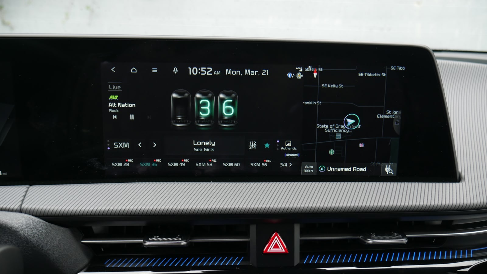
UConnect would be the most natural choice here, but since we’ve already given it “best overall” recognition, we thought it best to highlight our other favorite infotainment system from a non-luxury manufacturer. We’re cheating halfway here by including both Kia’s UVO and Hyundai’s Blue Link, but considering they’re largely the same with branding and minor aesthetic differences, they both deserve to be here.
Like UConnect, Hyundai and Kia’s infotainment systems are recognized for being easy to operate, super fast and visually uncomplicated. The menu structure makes it easy to select the app you want to use. The radio interface is easy to navigate and Apple CarPlay/Android Auto is always supported. We’re frustrated that wireless CarPlay and wireless Android Auto aren’t universally supported – it depends on the trim/screen size you choose on some models – but connecting isn’t such a hardship anyway.
Neither Hyundai nor Kia load their infotainment systems with redundant features and menus that complicate things, so you can’t get lost five menus deep. However, there’s the weird “Sounds of Nature” feature that lets you fill the cabin with random soundtracks of busy cafes, falling water, and more.
Hard buttons for many infotainment controls are present on most Hyundais and Kias, although the newer products tend to use touch-sensitive “buttons” rather than pushable ones. We definitely prefer the non-haptic controls, but appreciate that at least Hyundai/Kia still appeals to those who prefer to operate the vital car controls outside of a single central touch screen.
Honorable Mention: Mazda Connect — Mazda
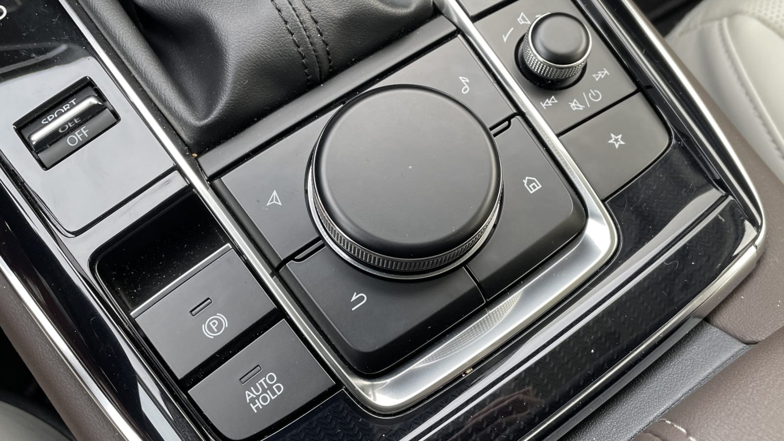
Mazda, as it does with many things, has a specific philosophy when it comes to infotainment systems. First, the company has serious beef with touchscreens. Even in Mazdas that do have touchscreens, the touch functionality is disabled as soon as you start moving. Instead, Mazda would prefer its drivers control the screen via a button very similar to BMW’s iDrive button. If you haven’t figured it out by now, we love this way of thinking.
Our recognition of Mazda here only extends to the latest version of Mazda Connect, which has made it to almost every new Mazda model, but debuted in the Mazda3. Mazda places the screen deep in the dashboard at a far greater distance than essentially any other new car, in an effort to reduce the shift of a driver’s eyes from the road to the screen and back. This keeps your eyes focused and adapted to the road better than others, which is an important key to safe use of an infotainment system.
In addition, the system’s interface is split into an ultra-simplistic and uncluttered layout. Most of the screen is filled with black space and Mazda displays only the information you absolutely need. Moving the system is done in the same way as in BMW iDrive 7 with the button that scrolls, rocks and clicks. It is very intuitive and the menu structure is set up to allow this kind of navigation.
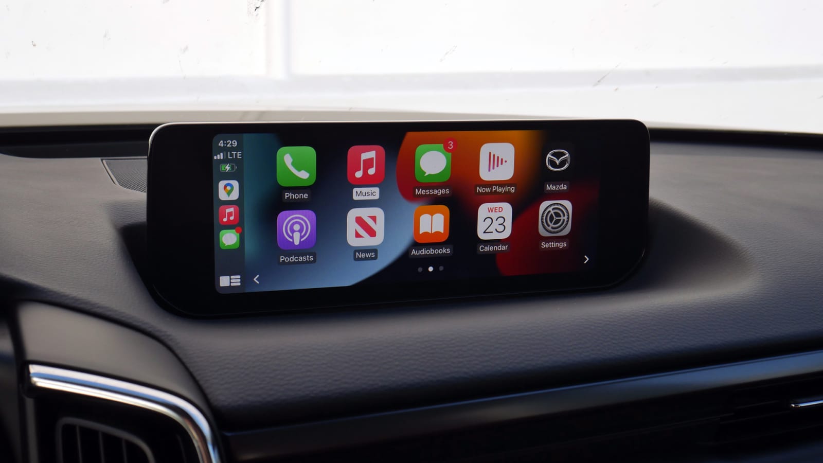
Those who want the latest gadgets and gizmos may be disappointed with the lack of a funky user interface with colors and animations, but anyone who wants to get the job done as simply and easily as possible will appreciate Mazda’s software.
Our biggest complaint comes from tuning the radio. If you like to browse different stations on a regular basis, things get difficult. The lack of presets, the non-existent tuning knob and the radio menu with few functions make it tricky. But if you send all your media through your phone or a few radio stations, don’t worry. Using Apple CarPlay or Android Auto is also super easy, as you can use the hard buttons on all sides of the button to quickly switch between apps. Press the “Navigation” button and Google Maps will be displayed. Tap the “Music” button and Spotify (or whatever music app is currently playing) will appear. Normally, using CarPlay or Android Auto without a touchscreen is a source of frustration, but Mazda has figured out how to do even better than a touchscreen using familiar, old buttons.
Honorable Mention Two: MBUX — Mercedes-Benz
This one is for the tech geek who wants to be on the edge. It is not the easiest to use nor the most sensible to use. But it has more features than any other, and the user interface is the most visually appealing/futuristic of them all. MBUX is also home to the best voice assistant in the industry, which really helps make things easier when you have as many features to find and watch as the latest MBUX software.
There is also a caveat that MBUX is on this list. We’re referring to its latest version – debuted on the S-Class – which offers a ‘one screen’ approach to the home screen with the now standing screens. The old MBUX (still in many new Mercedes products today) is significantly worse because all your most used apps can’t be seen together on the screen. Instead, they sit in a sort of carousel and you have to scroll through them to find what you’re looking for. For the new MBUX UI everything is there, easy to find and easy to click on.
The speed with which it responds, the accompanying animations and pure customization are all as good as it gets for in-car software. Haptic on-screen feedback is a welcome feature, and while getting lost in menus is easy, Mercedes gives you a customizable sort of “quick access” tab that calls up commonly used settings for quick switching. Yes, Mercedes knows this is complex, but at least they’ve worked hard to make it more user-friendly. Don’t figure it out if you don’t want to spend time learning how it works, but once you’ve scaled the learning curve, there’s a lot of good in MBUX.
Related video: